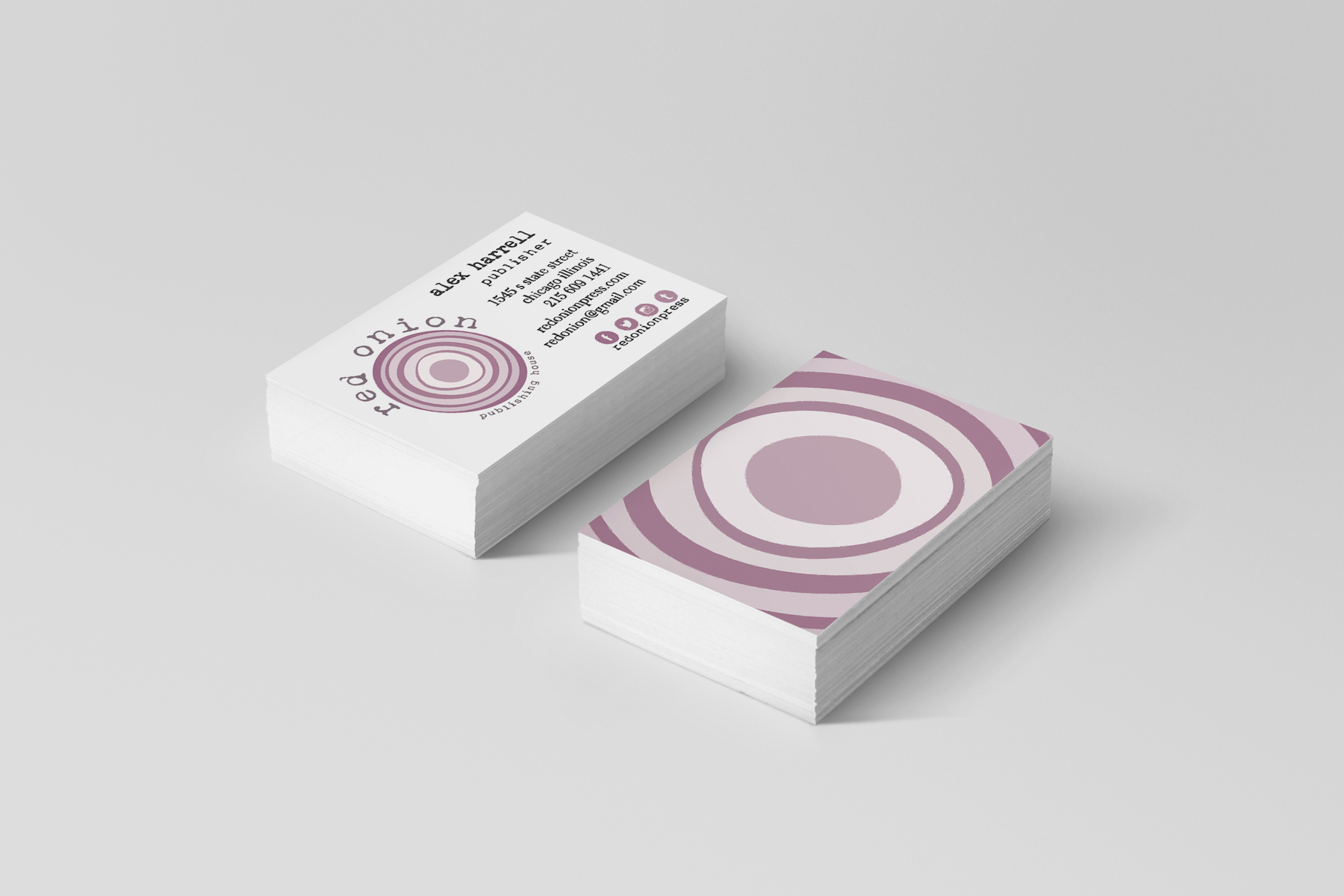
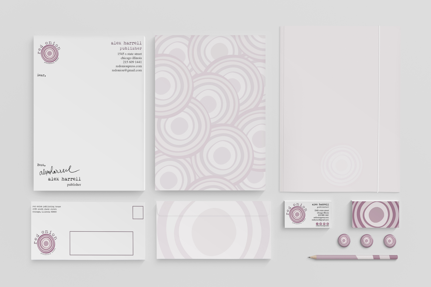
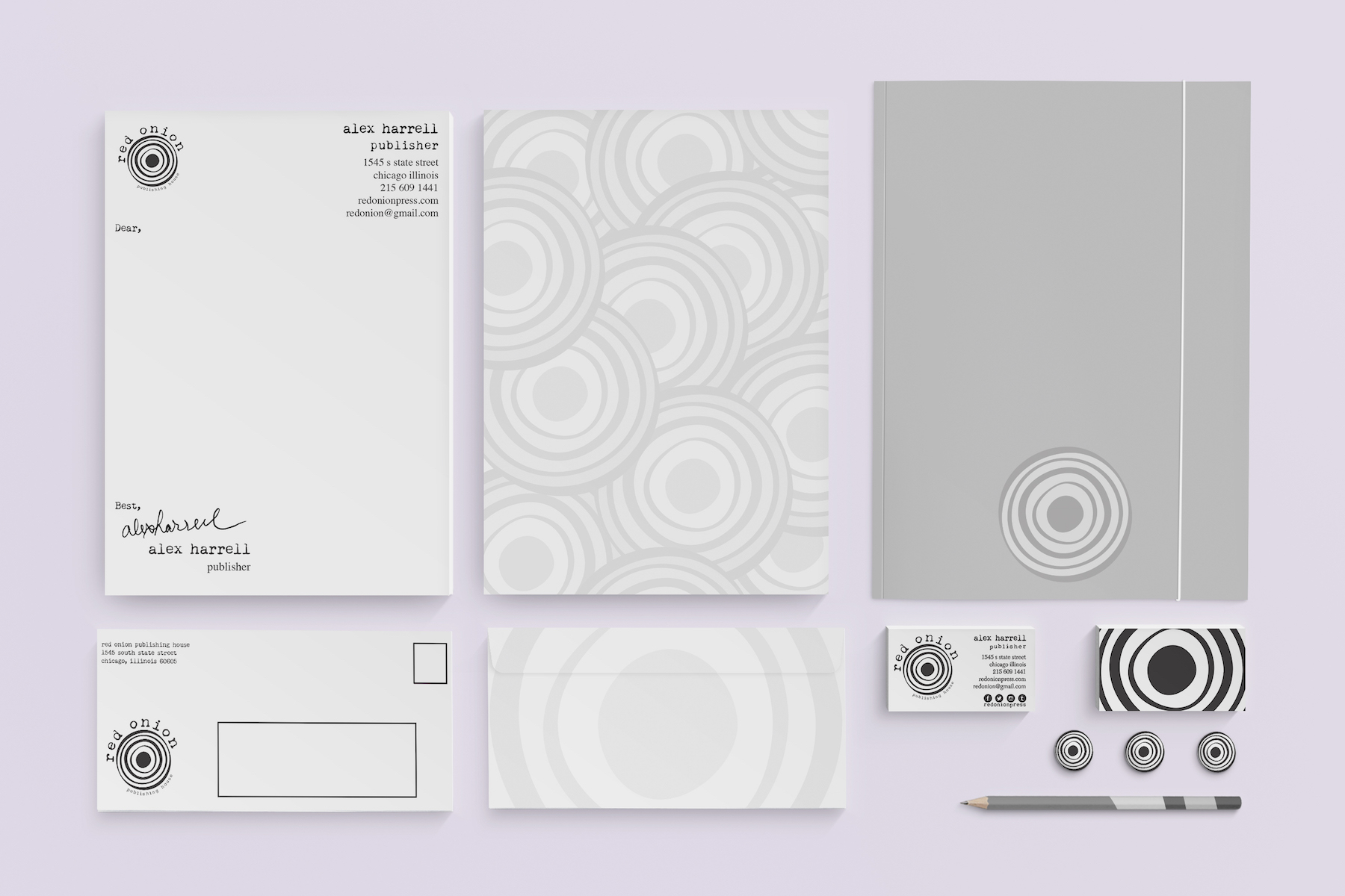
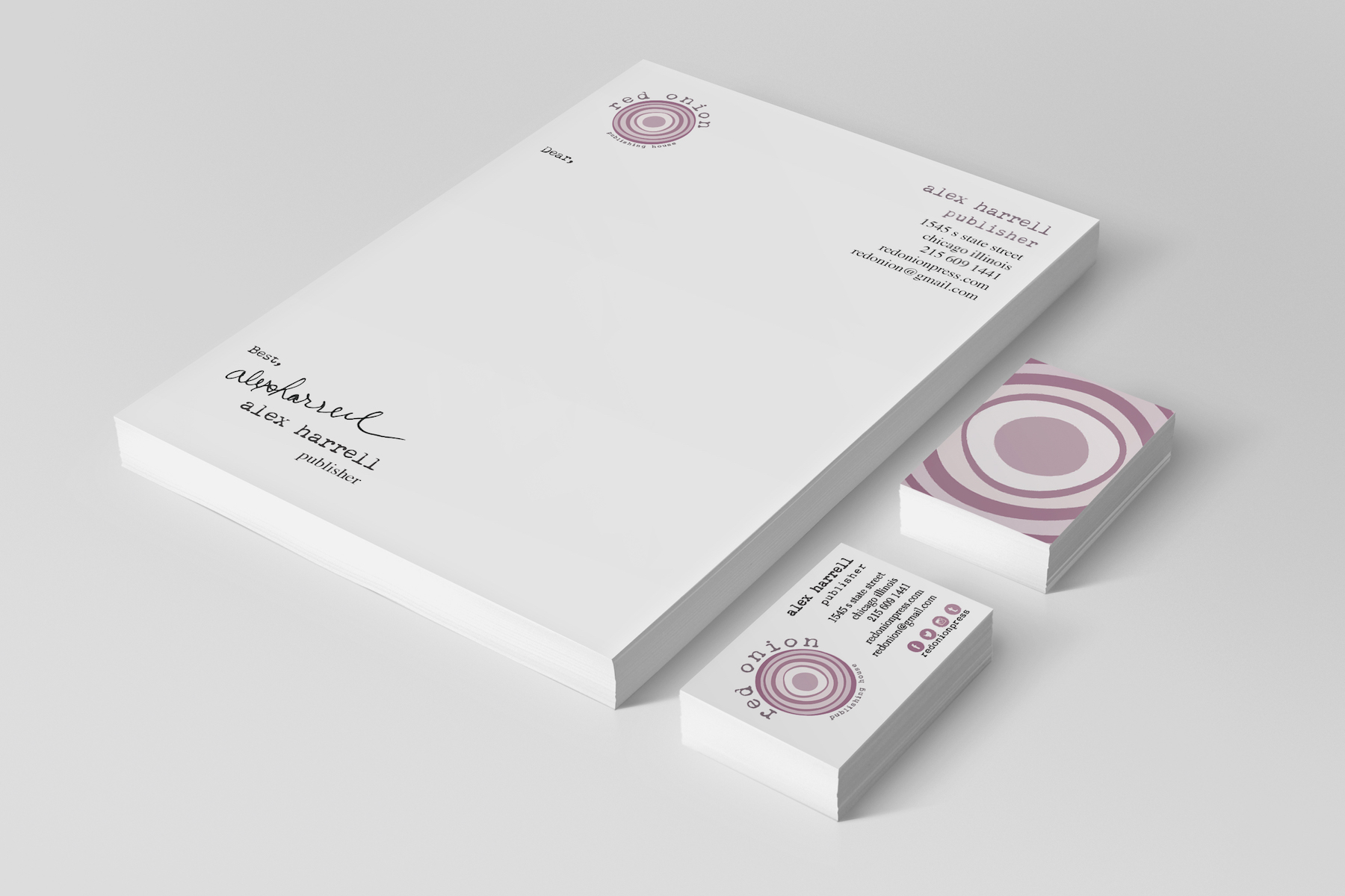
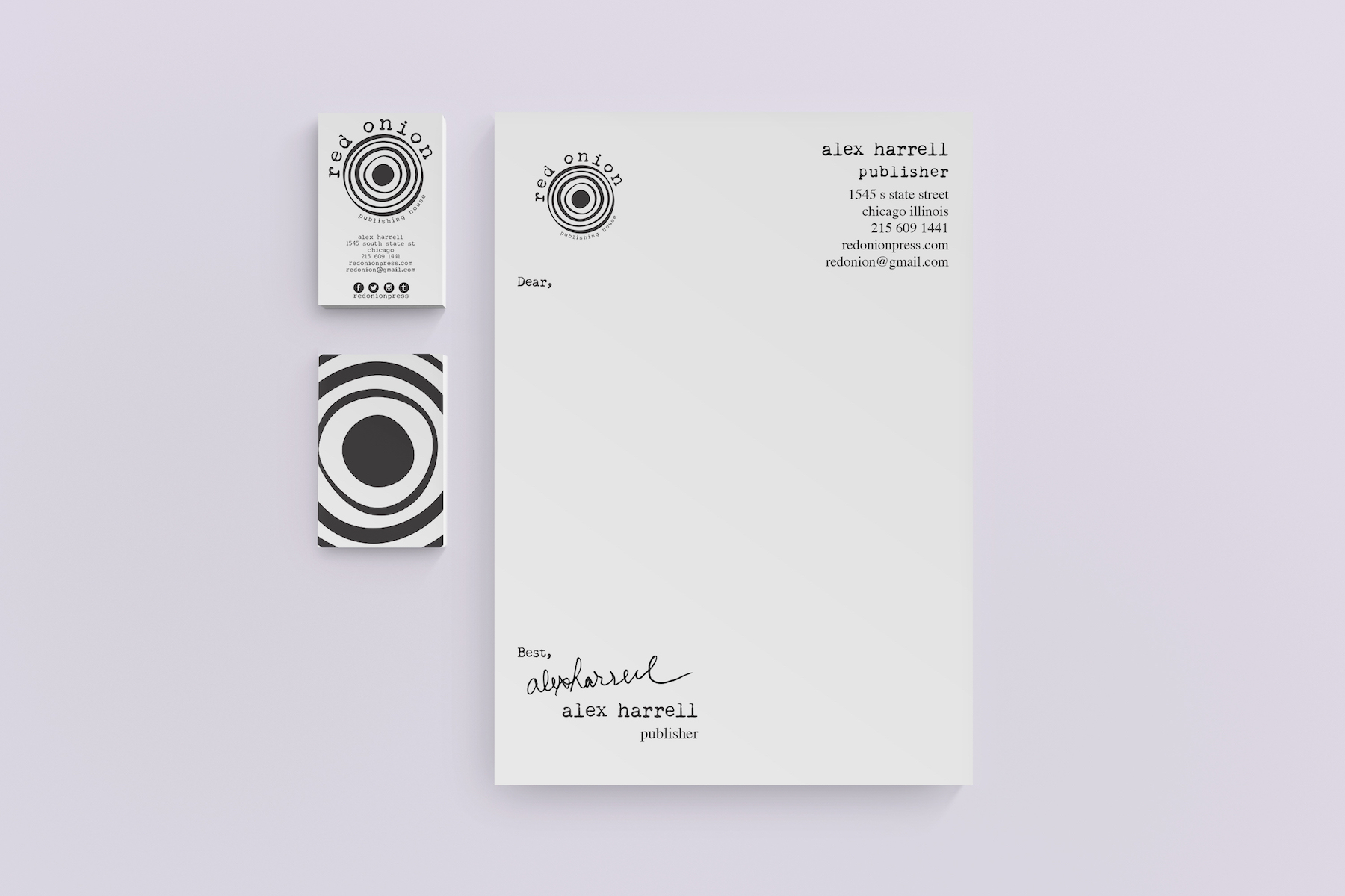
The outset of this project was to design a publishing house company based on a theme important or of interest to us. I chose to do the beatnik generation as my theme because I love this genre of literature. During the 1950s, the phrase "red onion" was slang for a dive bar. Thus, the name was born. I chose to use a typewriter-style font, because typewriters were highly popular during this time period and all of the great writers used them. I also chose to literally use a red onion as my mark (versus a dive bar logo of sorts) in hopes that fans of this particular genre will appreciate the reference.